The Psychology of Visual Identity: Why Logos Matter
A company's logo is the visual anchor of its entire commercial brand. In an overcrowded digital marketplace where users make credibility judgments within 50 milliseconds of landing on a website, an amateur, pixelated, or clunky logo immediately signals low trustworthiness, high risk, and cheap quality. Conversely, a clean, balanced, and memorable visual symbol establishes instant authority, commands higher pricing power, and fosters long-term customer recognition.
However, early-stage startups, solo freelancers, and budget-conscious creators do not need to spend $5,000 hiring an elite design agency to secure a professional brand identity. In this step-by-step masterclass, we teach you how to design a versatile, mathematically balanced, and scalable logo for free (or under $50) using modern design principles and vector tools.
The 5 Non-Negotiable Rules of Timeless Logo Architecture
Before opening any software, internalize the fundamental principles of professional visual identity:
- Simplicity Over Complexity: The world's most iconic logos—Nike, Apple, Target, Fedex—are radically simple. If your logo contains 15 lines, multiple drop shadows, intricate bevels, and four gradients, it will fail when scaled down to a 16px mobile favicon.
- Versatility Across Color Modes: A professional logo must function flawlessly in pure monochrome (solid black on white) and reverse monochrome (solid white on dark). If your design relies entirely on rainbow colors to be legible, the mark is structurally weak.
- Infinite Vector Scalability: Your master file must be engineered as an SVG or EPS vector coordinate path. Never design a logo as a raster JPEG or PNG; raster artwork pixelates immediately when printed on business cards or event banners.
- Timelessness Over Fleeting Trends: Avoid gimmicky visual trends (such as 3D glassmorphism or hyper-busy retro badges) that will look dated within 24 months.
- Contextual Relevance: The visual tone must mirror your industry vertical. A financial consultancy requires sharp, stable geometric lines; a children's toy company demands friendly, rounded curves.
The 4 Best Free & Affordable Design Pathways
| Design Method | Financial Cost | Technical Skill Required | Best For |
|---|---|---|---|
| Figma (Native Vector Canvas) | 100% Free | Moderate (Basic vector manipulation) | Tech startups, modern web developers, SaaS founders |
| Inkscape (Open Source Vector Suite) | 100% Free | Moderate to High (Illustrator alternative) | Print designers, custom bezier curve artwork |
| Canva Pro Custom Wordmark | $0 – $13/mo | Zero (Beginner friendly) | Clean typography wordmarks, local service businesses |
| Fiverr Verified Specialist | $25 – $75 | Zero (Delegated to freelancer) | Busy business owners who want complete branding packages |
The "Minimalist Wordmark" Strategy (High Authority, Zero Cost)
If you have zero design experience, do not attempt to draw a complex mascot or abstract geometric symbol. Instead, build a Minimalist Typographic Wordmark (similar to Sony, Braun, Google, or Uber):
- Select an Authoritative Typeface: Choose a clean, modern open-source sans-serif font from Google Fonts (such as Inter, Montserrat, Plus Jakarta Sans, or Space Grotesk).
- Refine Letter-Spacing (Tracking): Increase letter-spacing slightly (+2% to +5%) for an expansive, luxurious feel, or tighten it (-2%) for bold technical assertiveness.
- Introduce an Asymmetric Micro-Accent: Color a single letter, replace a standard dot on an "i" with a brand accent color, or tweak a geometric angle to create an unmistakable proprietary identifier.
Frequently Asked Questions (Logo Design FAQ)
What file formats should a professional logo package include?
A complete commercial package must include: Master Vector (.SVG or .EPS), Transparent High-Res PNG (RGB for web), Crisp JPEG, and a 32x32px Favicon (.ico or .png).
Can I use free online AI logo generators?
AI logo generators can provide rapid conceptual inspiration, but their raw outputs frequently suffer from asymmetrical vector glitches, bizarre text artifacts, and non-defensible copyright issues. Always recreate the concept cleanly in vector software.
Color Psychology & Palette Construction for Tech Brands
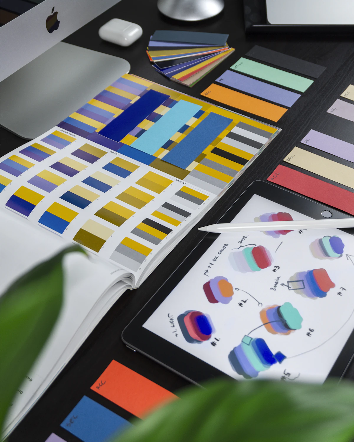
Color is the most immediate subconscious signal in brand communication. When choosing the color palette for your logo, limit your brand to a maximum of three core tones:
- Primary Dominant Tone (60%): Defines the primary emotional resonance of the brand. Blue signals security, technical precision, and stability (used by Intel, Dell, WordPress, Syed's World). Green signals growth, finance, and vitality.
- Secondary Neutral Tone (30%): Deep slates, charcoal grays, or clean off-whites that provide structural balance and background surfaces.
- High-Contrast Accent Color (10%): Vibrant orange, electric cyan, or emerald green reserved exclusively for primary buttons, notification badges, and focal anchor points.
Exporting & Handing Off Logo Assets for Production
When your vector logo is complete, organize your brand assets into a standardized folder hierarchy for developers and printers:
brand-assets/
├── vector/
│   ├── logo-primary.svg
│   ├── logo-monochrome-dark.svg
│   └── logo-monochrome-white.svg
├── web/
│   ├── logo-512x512.png
│   ├── logo-horizontal-header.webp
│   └── favicon.ico
└── guidelines/
    └── brand-colors-and-fonts.pdf